Demo
For the best viewing experience, click the Edit on CodePen button in the upper righthand corner of the Pen to open it in a new tab.
Summary
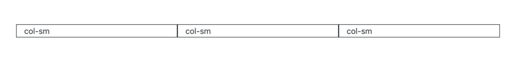
<div class="container">
  <div class="row">
    <div class="col-sm">col-sm</div>
    <div class="col-sm">col-sm</div>
    <div class="col-sm">col-sm</div>
  </div>
</div>
Details
You can modify the column class by adding a dash and a breakpoint name to the end of the class. A breakpoint is a specific screen or window width (in pixels) where the layout should change. These classes help turn your layouts into responsive layouts by collapsing into smaller layouts on smaller screen or window sizes. Here’s a list of the classes available and their associated breakpoint values:
col(applies to less than 576px)col-sm(greater than or equal to 576px)col-md(greater than or equal to 768px)col-lg(greater than or equal to 992px)col-xl(greater than or equal to 1200px)
Bootstrap 5 adds a col-xxl class with a breakpoint greater than or equal to 1400px.
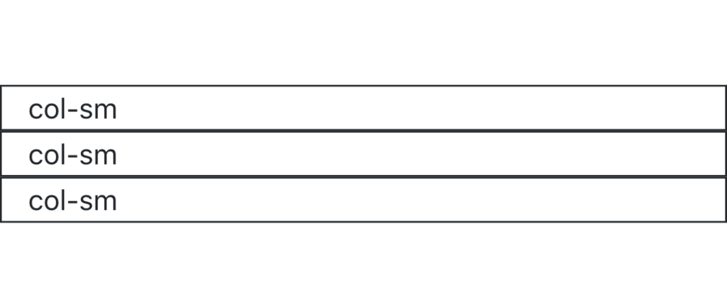
These classes are activated when the screen or window width is greater than or equal to the breakpoint value associated with that class. In the example in the Summary section above, the columns are in a row when the screen or window width is greater than 576px, since they are all using the col-sm class. When the screen or window is smaller than this width, the columns collapse into a single column view.
You can also add numbers to the ends of these breakpoint classes to set the widths of the columns. The general format is col-breakpoint-number. You can use the numbers 1 through 12 for these classes. Some examples would be col-sm-6, col-md-8, col-lg-3, etc. Here’s a full list of the classes available:
col,col-1,col-2, up tocol-12col-sm,col-sm-1,col-sm-2, up tocol-sm-12col-md,col-md-1,col-md-2, up tocol-md-12col-lg,col-lg-1,col-lg-2, up tocol-lg-12col-xl,col-xl-1,col-xl-2, up tocol-xl-12
In total, there are 65 column classes. Don’t feel overwhelmed by that number, though. As long as you understand how to breakpoints and sizing works, you should be able to use these classes.
Exercises
Recreate the HTML code from the Demo section in your index.html file.
Try resizing the window to see the row collapse into a single column view. Also, try changing the columns to different classes, such as col-md or col-lg. You can mix them up, too. Try pairing col-sm with col-md, or col-md with col-lg.