Demo
For the best viewing experience, click the Edit on CodePen button in the upper righthand corner to open up the Pen in a new tab.
Summary
<div class="container">
  <div class="row">
    <div class="col-12 col-md-8">col-12 col-md-8</div>
    <div class="col-6 col-md-4">col-6 col-md-4</div>
  </div>
</div>
Details
In the example above, you can see that multiple column classes are being used on individual div elements. This allows you to achieve more specific layouts at different screen sizes.
In this example, the first column starts out taking up two-thirds of the row when it’s above the 768px breakpoint because of the col-md-8 class. Once the window width is below that breakpoint, it takes up the entire row because of the col-12 class.
The second column only takes up one-third of the row above the 768px breakpoint because of the col-md-4 class. Once the width of the window is below that breakpoint, it gets bumped a row and takes up only half of the second row because of the col-6 class. (Technically, there’s only one row div, but since the first column is taking up the whole width, it essentially creates two rows on smaller windows.)
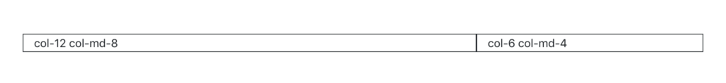
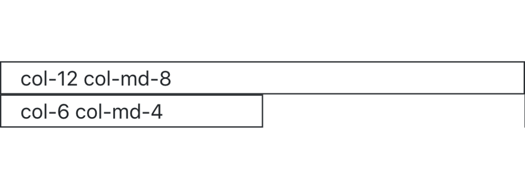
Note the order that the classes were applied to the element. When adding multiple column classes to an element, make sure you list them in order from smallest breakpoint to largest breakpoint (i.e., col-* first, then col-sm-*, col-md-*, etc.).
Exercises
Recreate the HTML code from the Demo section in your index.html file.
Try resizing the window. Notice how the layout changes shape at different breakpoints. Try changing the column classes used in the demo to create different layouts.