Demo
For the best viewing experience, click the Edit on CodePen button in the upper righthand corner of the Pen to open it in a new tab.
Summary
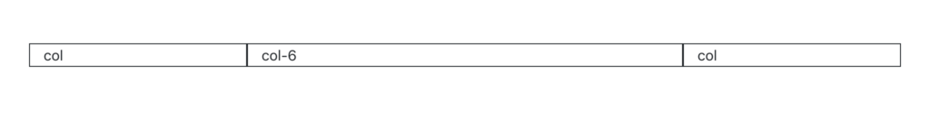
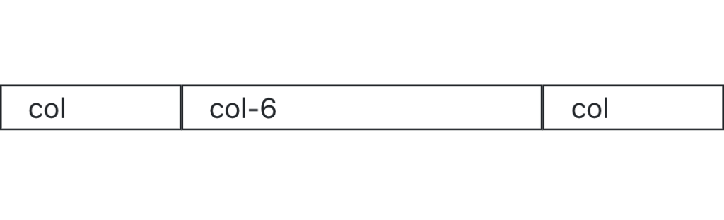
<div class="container">
  <div class="row">
    <div class="col">
      col
    </div>
    <div class="col-6">
      col-6
    </div>
    <div class="col">
      col
    </div>
  </div>
</div>
Details
You can modify the col class by adding a dash and a number at the end. You can use the numbers 1 through 12 (e.g., col-1, col-2, col-3, all the way up to col-12).
By adding a number to the column class, you are specifying the size of that column. Remember, Bootstrap is based on a 12-column system. If you use the class col-12, that column will take up the entire row. If you use col-6, that column will take up half of the row, and the other columns will fill in the remaining space.
Exercises
Recreate the HTML code from the Demo section in your index.html file.
Try changing the number on the column class. Remember, you can use the numbers 1 through 12. Try resizing the window as well.